
Understanding user challenges
CARRO USA needed a B2B website that communicated more than its product range. The challenge was to bring together the company’s history, product design innovation, quality, and smart features in a clear, cohesive way, helping potential business partners understand its capabilities and what sets its products apart.
Take a Look at the Original Website
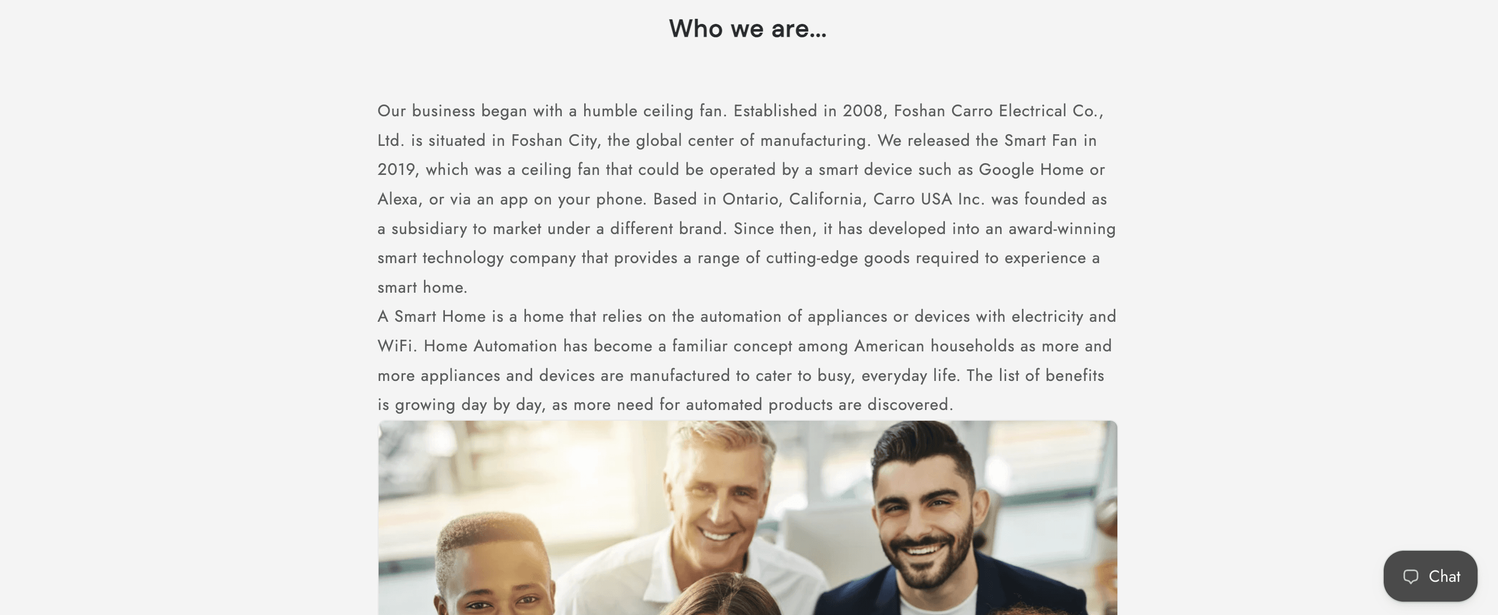
The original website used a straightforward layout centered on product listings and basic company information. While it introduced CARRO’s products and technology, the company’s history and mission were presented in lengthy text sections with generic supporting imagery.



I redesigned the website with a stronger visual identity, combining videos, lifestyle imagery, and clearly structured content to communicate CARRO’s capabilities to potential business partners.
I integrated videos throughout the site to introduce the company’s background, tell the story behind its products, and showcase product details. Images of ceiling fans installed in home interiors placed the products in context, highlighting how they complement different living spaces.
I also organized key features into distinct visual sections with concise headings and supporting imagery, making design innovation, product quality, and smart functionality easier to explore and understand.
To support product browsing, I created a digital flipbook catalog with clear product categories, helping customers explore the collection and find products that match their needs.


According to the sales team, customers found it easier to locate the products they were looking for and responded positively to the website’s updated visual design. The site also became a frequently used resource for the sales team, bringing product and company information together in one place to support customer conversations. Both customers and sales staff could more easily find the information they needed.
